Digital Photography and Imaging-Project 2
17/6/2024--(Week9-Week11)
JING KEYAO/0370732/Bachelor of Design (Honours) in Creative Media
Digital Photography and Imaging
Project 2
Table of Content:
Module Brief:
<iframe src="https://drive.google.com/file/d/1FsPUaxu6YSQHpzCflz4SSXkWbxAA4Cpy/preview" width="640" height="480" allow="autoplay"></iframe>
LECTURE:
Week 7
-What Is Double Exposure Photography?
Double exposure photography refers to merging multiple images. The goal is to make them surreal, emotional, or humorous. They usually feature silhouettes.
1. Using the Tilt-Shift Effect
2. Create fake reflection
3. Experiment with simple portraits and details textured
4. Convert your results to Black & White
5. Work with silhouette
6. Pick two random photo
7. Make simple objects look fascinating
8. Use Shadow
Fig.1a.01
-PHOTOSHOP : Blend Modes
Fig.1a.02&03
Here’s a quick guide:
1. Select the Layer 1 (Fire) to be on top of the Background (Musicians)
2. Go to the Blending Modes option
3. Select “Screen”
4. As a result, all of the pixels on the fire will be selected as Screen blending mode.
Fig.1a.04
Week 9
-Realism VS Surrealism
Realism Surrealism
Surrealism is a cultural movement focused on type of arts to express about the artist’s idea themselves.
-Capturing your Dream
1. Sketch It Out
Take a piece of paper and pen/pencil or a tablet and start to sketch. Draw your vision out roughly. Don't finesse any details yet, but just lay out key points of your vision.
2. Find Reference Images
Gathering reference images will help you greatly in realizing your new idea. Gather images that directly relate to what you have in mind.
-Mindset During Creation
1. "Does this look real?"
Surrealism is at its best when it's convincing enough that it could be real, however we obviously know that the subject matter you are creating is nonexistent, thus is not real.
2. Make it happen to the best of your ability.
When you try to approach something challenging, you will learn the skills you may need for next time to make it work. The worst thing you can do is be afraid and back off from your idea, because you would never learn that way.
TUTORIAL:
Week 7
Here are some steps to create a double exposure:
-Open portrait image in Photoshop
1. Click W for Object Selection/Quick Selection/Magic Wand tools ser
2. Click “Select Subject” at Option bar
3. Click “Select and Mask” at Option bar
-Under “Select & Mask”:
1. Select “Brush Tool” or “Lasso Tool”
2. Clean the background.
3. Check edges.
4. Output: Select Layer with Layer Mask.
5. Click OK to leave “Select & Mask” mode.
-Increase contrast for portrait layer:
1. Add Curve adjustment layer.
2. Make S curve.
3. Right click on curve layer select clipping mask.
1. Add forest image and reposition it.
2. Select clipping mask.
3. Double click bg’ solid colour, select the “grey sky colour” with eye dropper.
4. Add mask layer.
5. Select brush tool, foreground colour black. Adjust brush size, hardness, and flow.
6. Unmask her face.
7. Duplicate forrest layer, flip vertical and reposition, select clipping mask.
8. Adjust the mask, as well as the portrait’s mask.
9. Add the two birds’ images.
10. Select Darken/Multiply blending mode to remove white background.
11. Add Gradient map fill layer.
12. Select a gradient map that you want to experiment.
13. Bring down the opacity.
Week 9
How to Create Poster: https://drive.google.com/file/d/1hpE_PLNCke8nv4J28h2Yho-62SnYr5kU/view
PRACTICAL:
DOUBLE EXPOSURE
·Part 1: Follow tutorial
Fig.3a.01&02&03
-Process
I just follow the video on YouTube step by step, it's not that so hard, but let me get a new skill.
Fig.3a.04
Double Exposure_Final
· Part 2: Your own version Double Exposure portrait
For this exercise, we need to use our own photo and collect high-resolution background photos online. Then, we need to import these photos into adobe PS and edit them to black and white/monochrome. Also, the image should be (1920x1080) landscape or (1080x1920) portrait.
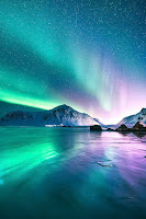
This is high-resolution background i found on Google:
Fig.3a.06&07
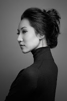
A PHOTO OF ME
I chose the glacier and the aurora as the background just because I wanted to see the aurora recently, so I incorporated them into my photos.
POSTER DESIGN
Mr.Fauzi given us some steps to create poster design:
1. Based on your research, develop a simple summary and make a simple tagline from it.
2. Create a simple typography design for the tagline.
3. Visualize the tagline into a poster design.
4. Focus on product photoshoot or image manipulation for the main subject.
Poster reference:
-Reference
These are the posters I found on Pinterest. I mainly looked for posters related to disabled people, which will give me a lot of inspiration.
Ex.3b.
03
Ex.3b.04&05&06
-Process
I mainly used the layout of the reference figure 2 to design my poster, because it has a diagonal design, and at the same time, it has a good visual effect and an emphasis effect by placing the main body in the center.
This is a overall layout sketch and a artificial limb I drew on procreate:
Ex.3b.07
Ex.3b.08
After drawing all the elements, I started to make my poster on Photoshop because there are more effects and filters on Photoshop.
The following two posters are the first ones I made:
Ex.3b.09&10
Even though it doesn't look bad, I don't think the design is outstanding and I'm still not very satisfied. For example, the first picture is very chaotic. Although the second picture has been significantly changed, it still doesn't reach my ideal state.
Therefore, I chose to jump out of my comfort zone and change the color of the overall picture, which was an adventure for me, cuz the change of the overall color would face a lot of difficulties.
Ex.3b.11
Fortunately, my choice was not wrong, and the changed color gave me a new look and more visual impact.
-Final
Final Poster Design_JING KEYAO_JPG
-TITLE: Breaking Barriers·Building Bridges
-DESCRIPTION:
First of all, my inspiration comes from life. Although disabled people are getting more and more attention now, but there are few products that can really be applied by disabled people, and the price is also very expensive, which is not affordable for ordinary disabled people. So we have to break this deadlock and work together to advance technology, to transform lives and make it available to those who need it.
In the process of design, because I hope this poster can bring people a positive feeling, my overall tone is very bright, which will not only have a visual impact, but also alert the audience. And, the overall layout was diagonal, but because I wanted to emphasize the theme, I crossed the mechanical legs diagonally to form an "X". At the same time, in order to distinguish and emphasize the existence of the disabled, I changed the color of the disabled to gray and black, which can not only reflect the weakness of the disabled, but also arouse the audience's resonance.
REFLECTION:
-This was my favourite assignment from DPI so far, as I got to draw and express myself as much as I could through this piece. I got to combine photo editing and drawing into one piece and I really enjoyed working on this piece. Overall it was really fun and not difficult.
-For the poster design, the theme is equality, but to be honest, this equality involves many aspects, so I spent a lot of time just to determine a theme, collect a lot of information, and finally chose the theme of equality for the disabled.
-Because I have not been satisfied with my draft, I began to try a technique that I have never tried before, that is, to add special effects such as aperture to make the poster look more three-dimensional and glossy. I have to say that although the process is very difficult, I like the effect very much, which is a big breakthrough for me.
Further Projects:


Comments
Post a Comment