Advanced Typography-Task1 Exercise1&2
24/09/2024 — 15/10/2024 (Week 01 — Week 04)
JING KEYAO / 0370732
GCD 61004 / Advanced Typography / Bachelor of Design (Hons) in Creative Media / Taylor's University
JING KEYAO / 0370732
GCD 61004 / Advanced Typography / Bachelor of Design (Hons) in Creative Media / Taylor's University
Task 1 / Exercises: Typographic Systems & Type & Play
Table of Contents:
-Week1-4
Research > Process / Sketch > Final Output
Research > Process / Sketch > Final Output
Research > Process / Sketch > Final Output
Lectures:
Week 1 / Typographic Systems
-Eight major variations
(Axial, Radial, Dilatational, Random, Grid, Modular, Transitional, Bilateral)
1. Axial System: All elements are organized to the left or right of a single axis.
Fig.1a.01_Axial System
2. Radial System: All elements are extended from a point of focus.
Fig.1a.02_Radial System
3. Dilatational System: All elements expand from a central point in a circular fashion.
Fig.1a.03_Dilatational System
4. Random System: Elements appear to have no specific pattern or relationship.
Fig.1a.04_Random System
5. Grid System: A system of vertical and horizontal divisions.
Fig.1a.05_Grid System
6. Transitional System: An informal system of layered banding.
Fig.1a.06_Transitional System
7. Modular System: A series of non-objective elements that are constructed in as a standardised units.
Fig.1a.07_Modular System
8. Bilateral System: All text is arranged symmetrically on a single axis.
Fig.1a.08_Bilateral System
“Typography is the use of type to advocate, communicate, celebrate, educate, elaborate, illuminate, and disseminate. Along the way, the words and pages become art.”
— James Felici, The Complete Manual of Typography
Week 2 / Typographic Composition
Principles of Design Composition: Emphasis, isolation, repetition, balance ( symmetry / asymmetry ), alignment, perspective, rhythm, contrast.
Fig.1b.01_Principles of Design - emphasis
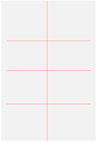
The Rule of Thirds: A photographic guide to composition. The intersecting lines are used as a guide to place the points of interest, within the given space.
Fig.1b.02_The Rule of Thirds
Typographic Systems: Out of all 8 systems, the grid system is mostly used which is derived from the grided compositional structure of letterpress. It is also known as the Swiss (Modernist) style typography in modern days.
Environmental Grid: Based on the exploration of an existing structure or numerous structures combined.
Form and Movement: Exploration of existing Grid systems to create something unique— by dispelling the serious surroundings of the application of grid systems and to see the turning pages in a book as a slowed-down animation. The placement of a form on a page over many pages creates movement.
Fig.1b.03_Form and movement
Week 3 / Context and Creativity
Handwriting
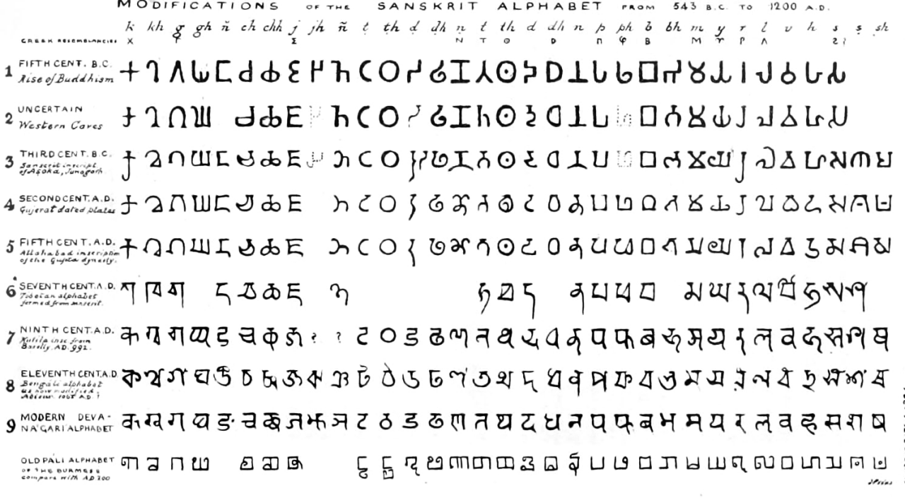
First mechanically produced letterforms were designed to directly imitate handwriting. The shape and line of hand-drawn letterforms are influenced by the tools and materials used to make them.
Fig.1c.01_Evolution of the Latin Alphabet
Fig.1c.02_Evolution of the Middle Eastern
Programmers and Type Design
Multiscript is a script that combines English (Latin) letters and Vernacular letters.
Local Movements and Individuals
Designers need to look inward and examine the histories, civilizations, and cultural communities and bring these past developments into the future.
Creativity and inspiration should begin by observing our surroundings and exploring our collective histories.
Week 4 / Designing Type
Designing Type
· type design carries a social responsibility so one must continue to improve its legibility.
· type design is a form of artistic expression.
Fig.1d.01&02
General Process of Type Design:
1. Research
2. Sketching
3. Digitization
4. Testing
5. Deploy
1. Research
- Investigate type design trends, historical fonts, and usage context. Understand the needs and goals of the typeface, including its target audience and intended applications.
2. Sketching
- Start with rough sketches, either on paper or digitally, to explore different letterform styles and characteristics. This helps establish the typeface's basic structure and visual identity.
3. Digitization
- Convert the sketches into vector-based digital formats using design software like Adobe Illustrator or font editors (e.g., FontLab, Glyphs). Refine the letterforms, adjust proportions, and ensure consistency across characters.
4. Testing
- Test the typeface in various sizes, contexts, and media. Check readability, spacing, and kerning. Make adjustments based on feedback to improve functionality and aesthetics.
5. Deploy
- Finalize the typeface and prepare it for distribution. This may involve generating font files (OTF, TTF) and providing documentation or promotional materials. The typeface is then released for use in projects or sold commercially.
Typeface Construction:
Typeface construction involves designing the shapes and structures of each letterform. This includes setting the basic proportions (such as letter height and width), adjusting the spacing between letters, and defining the variation in stroke thickness. For serif typefaces, it also involves designing the style of the serifs. The goal is to ensure visual harmony across all characters and make the typeface suitable for different applications.
Instructions:
Exercise 1 — Typographic System
This exercise task is to be done using Adobe InDesign only. Size 200 x 200 mm. In addition to black, you can use one other color. Graphical elements (line, dot, etc.) can be used but limitedly.
The 8 systems mentioned above are to be explored using the content given by Dr.Vinod :
The Design School,
Taylor’s University
All Ripped Up: Punk Influences on Design
or
The ABCs of Bauhaus Design Theory
or
Russian Constructivism and Graphic Design
Open Public Lectures:
June 24, 2021
Lew Pik Svonn, 9AM-10AM
Ezrena Mohd., 10AM-11AM
Suzy Sulaiman, 11AM-12PM
June 25, 2021
Lim Whay Yin, 9AM-10AM
Fahmi Reza, 10AM-11AM
Manish Acharya, 11AM-12PM
Page | 7
Lecture Theatre 12
Final Submission in JPEG file
Exercise 2 — Type & Play / Part 1 & 2
Part 1
In Exercise 2, Part 1, we were instructed to extract letterforms from photographs. After tracing rough letterforms, we need to refine them to ensure proper consistency of structure while maintaining the core features of the extraction.
Part 2
In part 2, we had to design a movie poster using the letterform from part 1. This task aims to improve the interaction between the letterforms and the chosen image.
Exercises
-Typographic System
This is the text I chose for the exercise:
The Design School,
Taylor’s University
The ABCs of Bauhaus Design Theory
Open Public Lectures:
June 24, 2021
Lew Pik Svonn, 9AM-10AM
Ezrena Mohd., 10AM-11AM
Suzy Sulaiman, 11AM-12PM
June 25, 2021
Lim Whay Yin, 9AM-10AM
Fahmi Reza, 10AM-11AM
Manish Acharia, 11AM-12PM
Lecture Theatre 12
·Research
The ABCs of Bauhaus Design Theory is a detailed exploration of the Bauhaus design philosophy, originally published in 1991 by Ellen Lupton and J. Abbott Miller. This book serves as an educational resource that delves into how the Bauhaus school revolutionized design, architecture, and visual arts globally.
Key characteristics include:
1. Form follows function: Design prioritizes utility over decoration.
2. Minimalism: Focus on clean lines and uncluttered spaces.
3. Use of basic shapes and colors: Geometric forms and primary colors dominate.
4. Integration of art and industry: Combining craftsmanship with mass production techniques.
5. Interdisciplinary approach: Blending architecture, art, and design into a unified concept.
The ABCs of Bauhaus Design Theory explores Bauhaus's focus on simple geometric shapes (triangle, square, circle) and its interdisciplinary approach to design. It emphasizes minimalism and the functional connection between form and use, influencing modern art and architecture.
·Process / Sketch
Axial System
Fig.3a.04_Axial System_Sketch
Fig.3a.05&06_Radial_Sketch
I was thinking if I needed to keep the diagonal lines because I was afraid the whole picture would be too blank. After having feedback from Dr.Vinod in class, he said I can remove that and adjust the overall layout to keep balance. Then I decided to zoom out the figure in the bottom right corner and enlarge the words around it.
Fig.3a.07_Dilatational System_Sketch
I was not very satisfied with the revolving design. I tried to make it different, with three lines pointing to three important information respectively, which I thought would be more intuitive to locate the key point. However, after Mr.Vinod's feedback, I realized that I had ignored the basic concept of design and I should not complicate the content. Useless lines only make the design look messy.
Fig.3a.08_Random System_Sketch
Fig.3a.10&11_Grid System_Sketch
First of all, I chose the second of the two drafts as the assignment for week1, because the lines of the second one were more prominent and less complicated than the grid system. After the feedback of Mr.Vinod's course, I thought that my overall layout lacked rationality and focus, so I enlarged the font of the theme.
Fig.3a.13_Modular System_Sketch
Fig.3a.14_Modular System_Sketch2
As for modular system, I am confident about it. Mr.Vinod also approved my design, but he said that it lacked harmony, so I chose all the fonts to be square. After changing the fonts, the overall design became harmonious.
Bilateral System
Fig.3a.15&16_Bilateral System_Sketch
Between the two designs, I chose the second one, I think appropriate white space will be more perfect, Mr.Vinod also approved my design in class.
·Final Output
Axial Radial_Final
Radial System_Final
Dilatational System_Final
Random System_Final
Grid System_Final
Transitional System_Final
Modular_Final
Bilateral_Final
Final Typographic System Without Grid_pdf
Final Typographic System With Grid_pdf
-Type & Play / Part 1 & 2
I learned that the whole exercise 2 is divided into two parts, one is to make letterforms, and the other is to apply the made letterforms to the movie poster. So when I started part 1, I had already thought of the theme of the movie poster as the microscopic world - "micro".
Part 1
·Research
When searching for images, I considered whether the image contained micro and also looked for images that met part 2.
Then I extracted the letters M, I, C, R and O:
Fig.3b.02
·Process / Sketch
Fig.3b.03_Letterform Extraction (M, I, C, R, O)
I was very troubled about choosing a reference font because I felt that no font was as rounded as I wanted.
Fig.3b.04_Reference Font
Fig.3b.05_Before and After font reference
This is my workspace when I'm making fonts.
Fig.3b.06_Workplace
Fig.3b.07_Baseline
Under the guidance of Dr. Vinod, I also modified the inside of the outline and added texture.
Fig.3b.08_Texture
This is the final letterform I will be used in Part 2:
Fig.3b.09_Final Letterform
·Final Output
Final Letterform_ "MICRO" _JING KEYAO_JPG
Final Letterform_ "MICRO" _JING KEYAO_PDF
Part 2
·Research
·Process / Sketch
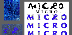
Because my theme is microorganisms, but the whole picture has no focus, it is all microorganisms, so I used the design of tearing paper to add emphasis to the background picture.
Fig.3b.11_Worked in PS
This is the background image I modified:
Fig.3b.12_First Background Attempt
Fig.3b.13
Fig.3b.14
Fig.3b.15_Second Background Attempt
After deciding on the background, I started to lay out the design of the entire page. After trying many possibilities, I finally chose to place the font in the middle of the background.


Fig.3b.16&17
After completing the first draft, I made the font more prominent by brightening its color and adding a halo around it. The inner circle kept its original color, which enhanced the font in color and level.
Fig.3b.18_Final Poster
Some detailed:
Fig.3b.19&20_Detailed
·Final Output
Final Poster_ "MICRO" _JING KEYAO_JPG
Final Poster_ "MICRO" _JING KEYAO_PDF
Feedback
Week 1
General Feedback:
·Press Command + Shift + > to increase text size
·Press Option + bottom arrow key to generate the leading
·Use the Shift + Return key to avoid much spacing between sentences in certain information.
How to evaluate your T1: Ex.1 Typo. Sys.
Do the arrangements adhere to the prescribed system? Comment on the information's hierarchy? Does the composition draw you in? Does the design adhere to best practices in typesetting? How can she/he improve on the design?
Week 2
General Feedback:
1. Except for black, we were allowed to use one other color.
2. be careful when using graphic elements to make sure it's functional.
Specific Feedback:
1. Remove some unnecessary lines to highlight the design system.
2. Adjust the fonts of some systems to maintain harmony and fit with the design system embodied.
How to evaluate T1: Ex.2 Finding Type
Are the strokes consistent in style & weight?
Comment on the refining process:
· Are the number of stages appropriate/enough?
· Has the form evolved while retaining crucial/core features?
· What can be improved upon?
Week 3
General Feedback:
1. Increase consistency to increase legibility.
2. Use primary colors for marks to increase contrast from the background; pastels are not recommended. The strongest color at the form, the lightest color at the background.
Specific Feedback:
1. The thickness of the letters should be similar to ensure completeness.
2. Add some texture to the inside of the font, refer to the picture.
Week 4
General Feedback:
Your judgment might be right or wrong. It is a risk you must learn to take IF you are going to develop confidence, independence, critical thinking, the ability to apply knowledge, self-reflection, and trust in yourself to learn.
Specific Feedback:
1. Movie poster design also needs to have the logo of the film production company and the main personnel involved in the film production.
2. You can add an aperture to the font to better highlight the theme and the font produced.
Reflection
Experience
In Exercise 1, working with the typographic systems in Adobe InDesign was both challenging and rewarding. The limited use of colors and graphical elements forced me to focus on the layout and composition to create visually appealing designs. Exploring different systems like grid, axial, and modular helped me understand the diversity of approaches in typography and how to create balance within constraints.
Observation
Through the exercises, I observed that different typographic systems offer distinct ways to guide the viewer’s eye across the design. For example, the grid system provides a sense of order and consistency, while the radial system introduces a dynamic feel. Each system requires careful attention to spacing, alignment, and hierarchy to maintain visual harmony.
Finding
I found that refining letterforms in Exercise 2 allowed me to appreciate the subtleties of type design. Tracing and modifying the letterforms helped me understand how minor adjustments can significantly impact legibility and aesthetics. Part 2, involving the movie poster, taught me how typography interacts with imagery, emphasizing the importance of choosing the right letterform style to complement the visual elements.
Further Reading
Grid System in Typography (1981)
Author: Josef Müller-Brockmann
Grid System in Typography
From "Grid Systems in Typography" (1981), I learned the significance of using grids to create structured and balanced typographic layouts. The book emphasizes that grids help organize content, maintain consistency, and enhance readability. It explains how grids can be flexible tools rather than rigid constraints, allowing for creative expression while still providing a sense of order.
The different types of grids, such as modular and column grids, each serve specific design purposes, helping to arrange text and images harmoniously. Understanding how to adjust grid proportions and align elements effectively was a key takeaway, as it plays a vital role in achieving a professional and visually appealing layout.
Overall, the book provided valuable insights into how grids act as an underlying framework in typography, guiding designers in making thoughtful decisions about spacing, alignment, and composition.
Further Projects:


Comments
Post a Comment