Advanced Typography-Task2: Key Artwork and Collateral
15/10/2024 — 12/11/2024 (Week 04 — Week 08)
JING KEYAO / 0370732
GCD 61004 / Advanced Typography / Bachelor of Design (Hons) in Creative Media / Taylor's University
JING KEYAO / 0370732
GCD 61004 / Advanced Typography / Bachelor of Design (Hons) in Creative Media / Taylor's University
Task 2 A & B / Key Artwork and Collateral
Table of Contents:
-Week5-8
LECTURES
Week 5 / Perception & Organization
Perception & Organisation
Perception is the way in which something is regarded, understood, or interpreted.
· Contrast
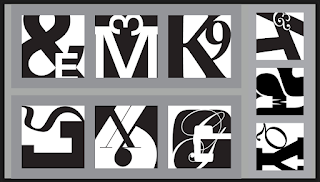
There are several methods in typography to create contrast the one on the left is devised by
Rudi Ruegg. They are self-explanatory.
Fig1.1_Example of the contract
- Contrast / Size: A contrast of size provides a point to which the reader’s attention is drawn.
Fig1.2_Example of the contract
- Contrast / Weight: Weight describes how bold type can stand out in the middle of the lighter type of the same style.
Fig1.3_Example of the contract
- Contrast / Form: Contrast of form is the distinction between a capital letter and its lowercase equivalent, or a Roman letter and its italic variant, condensed and expanded versions of typeface are also included under the contrast of form.
Fig1.4_Example of the contract
- Contrast / Structure: Structure means the different letterforms of different kinds of typefaces.
Fig1.5_Example of the contract
- Contrast / Texture: Texture refers to the way the lines of type look as a whole up close and from a distance.
Fig1.6_Example of the contract
- Contrast / Direction: Contrast of direction is the opposition between vertical and horizontal, and the angles in between. Turning one word on its side can have a dramatic effect on a layout.
Fig1.7_Example of the contract
- Contrast / Color: The use of color suggests that a second color is often less emphatic in values than plain black on white.
Fig1.8_Example of the contract
· Form: Refers to the overall look and feel of the elements that make up the typographic composition.
Typography can be seen as having two functions:
1. to represent a concept
2. to do so in a visual form
Fig1.9_Example of the form
INSTRUCTION
Task 2A — Key Artwork
In task 2A, we were given instructions to create a wordmark of our own name/pseudonym.
What we need to submit:
1. White / Black wordmark on black / white background
2. Color palette
- Wordmark in actual colors on the lightest shade of the color palette
- Wordmark in the lightest shade on the darkest shade of the palette
- Wordmark animation
Task 2B — Collateral
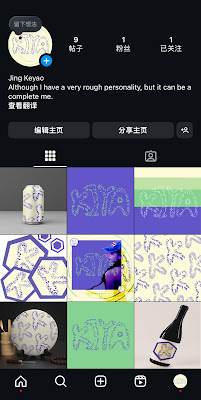
Using the wordmark created in Task 2A, we will expand the visual identity and apply the design concept to chosen collateral items. This includes creating a layout design for our own Instagram page.
What we need to submit:
- Collateral items 1, 2, and 3
- Instagram link
- Screengrab of the Instagram page in good resolution
EXERCISES
Task 2A — Key Artwork
·Mind mapping / Inspirations
I will select keywords from this mind map and combine them with my name to complete the wordmark design. Here is a mind map about me:
Fig3.1.1_Mind Map About Me
·Research
I found that lots of wordmark designs are based on the meaning of the word itself, so I will think about the meaning of my own name to design it.
·Process / Sketch
Fig.3.1.3_Sketches on Procreate
Words: Sloppy and small
Because I am short and often careless, the image I associate with it is a tadpole.
When I finished the first draft, I used Chinese characters, but it was difficult for teachers and classmates to recognize the prototype of the characters I designed, so I later changed to English characters.
Fig.3.1.4_Design on Ai
This is my final digitized wordmark
Fig.3.1.5_Final digitized wordmark
Because my favorite color is purple, I chose this color palette:
·Key
Artwork Animation
For animation, I think I am a very active person, so I plan to twist the lines around me and gradually form my name.
Task 2B — Collateral
·RESEARCH
Fig.3.2.1_inspirations on Pinterest
·
Process / Sketch
Fig.3.2.2_Mockup Process
Fig.3.2.3_Mockup Process
Fig.3.2.4_Mockup Process
Fig.3.2.5_Photo Process
·
Final Submission
Final Animation (PDF)
Fig.3.3.1_Black wordmark with white background
Fig.3.3.2_White wordmark with black background
Fig.3.3.3_Color Palette
Fig.3.3.4_Wordmark in actual color
Fig.3.3.5_Wordmark with darkest background
Final_Task 2A — Key Artwork_(PDF)
Tag: Although I have a rough personality, it can be a complete me.
Fig.3.3.6_IG overall layout
Fig.3.3.7_Collateral 1
Fig.3.3.8_Collateral 2
Fig.3.3.9_Collateral 3
Final Collateral Outcome_(PDF)
FEEDBACK
Week 5:
General Feedback:
1. Highlight the key terms from your inspiration sources.
2. It is advisable to design based on a specific keyword.
3. The design should relate to the original meaning of the word.
4. Avoid making the design too abstract or difficult to understand.
Specific Feedback:
My design is invisible to others, need to change it to English.
Week 6:
General Feedback:
The color must contrast between the primary and background.
Specific Feedback:
I need to do more fast, the color is okay.
Week 7:
General Feedback:
·Expanding the wordmark should reflect the brand's identity
·The IG layout should be suitable to watch.
Specific Feedback:
Absent(due to another work)
REFLECTION
Experience
Task Two has been an incredibly rewarding and enjoyable experience throughout this module. The opportunity to merge my personal identity with my design approach felt deeply engaging and allowed for a great deal of self-expression. This project required me to use creative tools like Illustrator, Photoshop, and After Effects, which expanded my technical proficiency. Although I faced challenges while working with Adobe After Effects, especially during the initial stages of animating, persistence, and experimentation led to a result I’m proud of. I believe incorporating a more dynamic element, such as a sequence of intricate animations, could have taken the final outcome to another level.
Observation
While working on Task 2B, where we created an Instagram grid layout, I gained a clearer understanding of how to evaluate design consistency. Analyzing my posts side by side revealed areas where the balance between colors, typography, and composition needed improvement. Through refining these elements, I was able to create a cohesive visual story, which significantly enhanced the overall appeal of my designs.
Findings
Researching platforms like Behance and creative branding case studies played a key role in shaping my ideas for this project. By observing real-world examples, I realized how identity-based designs carry a strong narrative and impact. This inspired me to take a more curious and adaptive approach in my creative process. I’ve learned that continually exploring and drawing inspiration from a variety of references not only strengthens creativity but also leads to more compelling and professional results.
FURTHER READING
Fig_"Thinking with Type" book
By Ellen Lupton
“Thinking with Type” by Ellen Lupton is a practical and essential guide to typography for designers, writers, and students. The book is divided into three sections—Letter, Text, and Grid—covering the fundamentals of type design, layout, and organization.
The Letter section introduces the anatomy and history of typefaces, teaching readers how to select and understand different type styles.
The Text section focuses on how typography influences readability and meaning, emphasizing hierarchy, alignment, and spacing.
The Grid section explains layout structures, helping designers create balanced and organized designs.
With real-world examples and exercises, the book connects typography theory to creative practice, making it a valuable resource for both print and digital design.


_%E7%94%BB%E6%9D%BF%201%20%E5%89%AF%E6%9C%AC.jpg)
_%E7%94%BB%E6%9D%BF%201%20%E5%89%AF%E6%9C%AC%206.jpg)


-19.png)
-26.png)
-21.png)

_%E7%94%BB%E6%9D%BF%201%20%E5%89%AF%E6%9C%AC%205.jpg)
_%E7%94%BB%E6%9D%BF%201.jpg)
-06.jpg)


Comments
Post a Comment