Typography-Task2: Typographic Exploration & Communication
21/5/2024--(Week5-Week7)
JING KEYAO/0370732/Bachelor of Design (Honours) in Creative Media
Typography
Task 2 (Typographic Exploration & Communication)
Table of Content:
LECTURES:
-Week 5 / 20.5.2024 ( Typo_5_Understanding )
-Letters / Understanding Letterforms
The uppercase letter forms below suggest symmetry, but in fact it is not symmetrical. It is easy to see the two different stroke weights of the Baskerville stroke form (below).
And the width of the left slope is thinner than the right stroke.
Both Baskerville (previous) and Univers (below) demonstrate the meticulous care a type designer takes to create letterforms that are both internally harmonious and individually expressive.
Fig.1a.01&02
A comparison of how the stems of the letterforms finish and how the bowls meet the stems quickly reveals the palpable difference in character between the two.
The lowercase ‘a’ of two seemingly similar sans-serif typefaces—Helvetica and Univers.
Fig.1a.03
-Letters / Maintaining x-height
The x-height generally describe the size of the lowercase letterforms.
We must keep in mind that curved strokes, such as in ‘s’, must rise above the median (or sink below the baseline) in order to appear to be the same size as the vertical and horizontal strokes they adjoin.
Fig.1a.04
-Letters / Form / Counterform
The latter is particularly and important concept when working with letterforms like lowercase ‘r’ that have no counters per se. How well you handle the counters when you set type determines how well words hang together—in other words, how easily we can read what’s been set.
Fig.1a.05
One of the most rewarding way to understand the form and counter of a letter is to examine them in close detail. The examinations also provide a good feel for how the balance between form and counter is achieved and a palpable sense of letterform’s unique characteristics. It also gives you a glimpse into the process of letter-making.
Its worth noting here that the sense of the ‘S’ holds at each stage of enlargement, while the ‘g’ tends to loose its identity, as individual elements are examined without the context of the entire letterform.
Helvetica Black. Baskerville.
Fig.1a.06
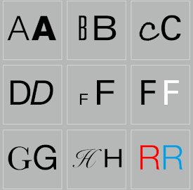
Letters / Contrast
The basic principles of Graphic Design apply directly to typography.
The simple contrasts produces numerous variations: small+organic/large+machined; small+dark/ large light …
Fig.1a.07
-Week 6 / 27.5.2024 ( Typo_6_Screen&Print )
-Typography/ Different Medium
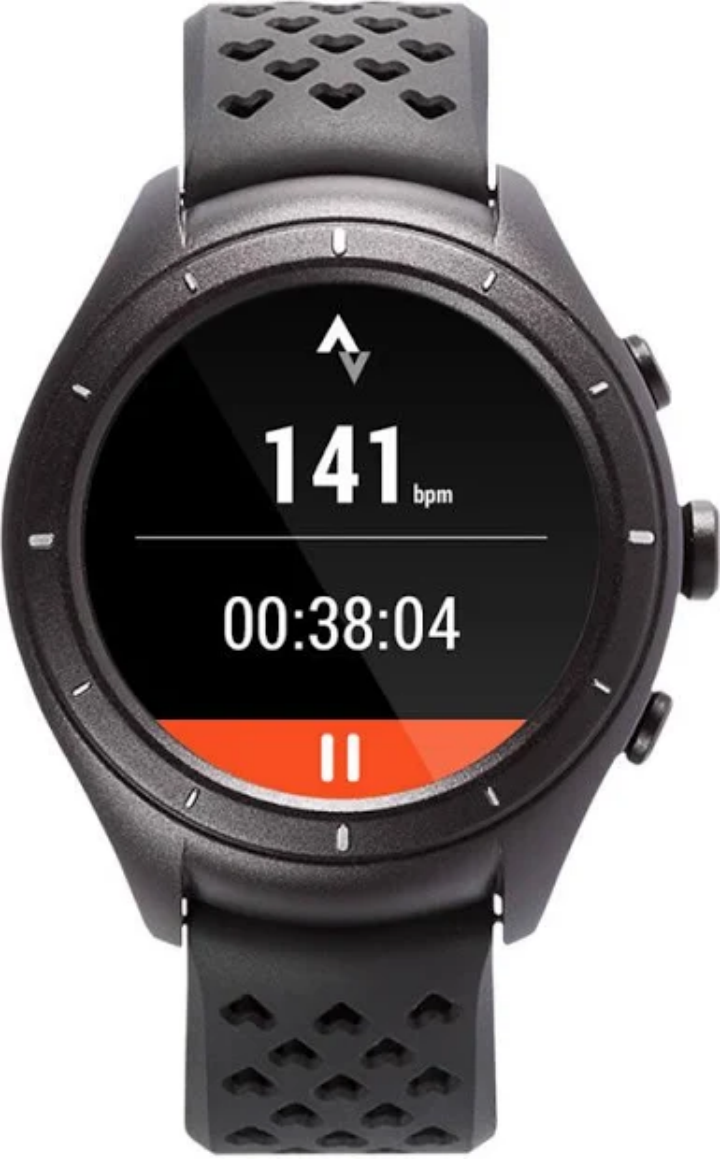
Today, typography exists not only on paper but on a multitude of screens. It is subject to many unknown and fluctuating parameters, such as operating system, system fonts, the device and screen itself, the viewport and more. Our experience of typography today changes based on how the page is rendered, because typesetting happens in the browser.
-Print Type Vs Screen Type
Primarily, type was designed intended for reading from print long before we read from screen. It’s the designer’s job to ensure that the text is smooth, flowing, and pleasant to read.
Fig.1b.01
Fig.1b.02
Screen. Print.
Fig.1b.03
Pixel Differential Between Devices:
Fig.1b.04
Print Type Vs Screen Type:
Fig.1b.05
Static Vs Motion:
Static typography expresses words with little characteristics. Dynamic features have much more expressive possibilities than traditional attributes like bold and italics.
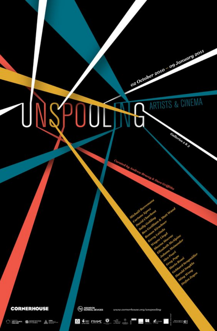
Typographers have the chance to "dramatize" type through temporal media, making letterforms more "fluid" and "kinetic". Typographic information is presented in film title credits, frequently animated to bring the text to life. Animated text is a common feature of motion graphics, especially in the branding of film, television production films, music video and advitisement.
Fig.1b.06&07&08
INSTRUCTIONS &EXERCISE:
Module Brief:
<iframe src="https://drive.google.com/file/d/1i_nuyoPuk1Gi_BtQEAKMebMYHsiaJv4u/preview" width="640" height="480" allow="autoplay"></iframe>
EXERCISES:
-Editorial Text Formatting
"In this task you will be asked to express typographically the content provided in a 2-page editorial spread (200mm x 200mm per page). Choose 1 from the 3 text options provided. No images are allowed. However, some very minor graphical elements, i.e. line, shade, etc. might be allowed."
---
·Initial Process (layout sketches, type expression exploration & text formatting)
After watching the video provided by Mr.Vinod, i began to start think about what I'm going to do, within these three text options. So firstly, i drew different potential sketches on Procreate.
Fig.2a.Sketch_01
Fig.2a.Sketch_02
After drawing potential Title, i passed the second one and do further exploration on first one.
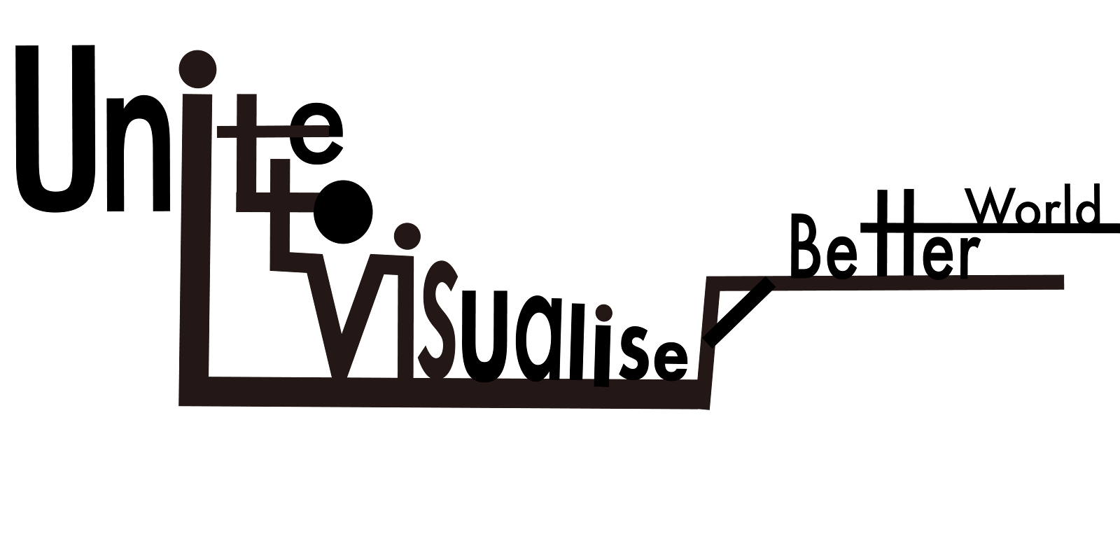
This is my first final sketch, i really liked the design, because the word "visualise" contains two "i" at the same time, I make the word artistic and add interest, also, the big "V" enhances the visual effect.

Fig.2a.first final sketch
After watching my sketch, Ms.Low asked me why I write two " visualise " in it. I couldn't answer, because I just thought such a design looked good and had no other practical meaning.
So i have to think about another sketches.
Fig.2a.Sketch_03
Fig.2a.Sketch_03_digitization
Due to the studying week, i have no idea to show this sketch, so i directly do the further text formatting.
·Layouts
Fig.2a.Layouts Sketch_02
Fig.2a.Layouts Sketch_03
Fig.2a.Layouts Sketch_04
Fig.2a.Layouts Sketch_05
Fortunately, Ms.Low asked us to post the sketch in FB, so that she could give us feedback so that we could complete the assignment better.
She went with my Fig.2a. Sketch_02 layout, but because the bottom left corner was too empty, I thought adding something would make the layout look more reasonable and beautiful.
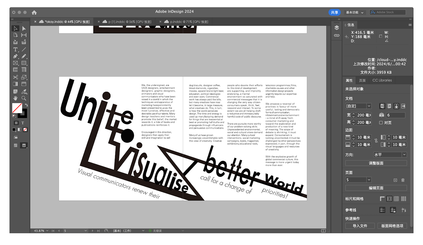
·FINAL Editorial Spread
Final Task2_Without Grid_PNG (11/6/2024)
Final Task2_Without Grid_PDF (11/6/2024)
Final Task2_With Grid_PNG (11/6/2024)
Final Task2_With Grid_PDF (11/6/2024)
HEAD LINE:
Font/s: Futura Std Bold
Type Size/s: 17 pt
BODY:
Font/s: ITC New Baskerville Std Roman
Typ Size: 11 pt
Leading: 11 pt
Paragraph spacing: 14 pt
Characters per-line: 33
Alignment: Left aligned
Margins: 10 mm
Columns: 3
Gutter: 5 mm
FEEDBACK
Week6:
General feedback:
·Upload progress on Facebook page, cuz other professor can see.
·Before doing assignment, we need to watch lecture recording on Youtube.
Specific feedback:
·I don't have to repeat " Visualise " twice.
·Try to explore more layout
Week7:
General feedback:
We are encourage to post our final task 2 editorial layout in FB by 11 June, to have feedbacks for design revision, before submission on 14 June.
Specific feedback:
Formatting the subtitle 'Visual communicators renew their call for a change of priorities' in continuous reading.
REFLECTION
Experience:
Thanks to task1, I have gradually mastered the operation of ai and id software. Compared with the first time, the only difficulty in this assignment is to design the headline and the layout of the text position. Although we met the study week and other public holidays, the professor was still very dutiful and gave us feedback on our Task2.
Observations:
In the process of finishing the assignment, I found that I was always too stubborn and entangled in the first sketch, but when the professor rejected it, I began to try other sketch designs. Finally, I found that there was indeed more possibility for my creativity in the assignment, and I should broaden my thinking and not be limited.
Findings:
After completing this assignment, I found that typography is not only limited to text editing and layout, but also includes more details, such as how to make a good title. Only good titles can attract readers, and how to place the text in the most suitable position.
FURTHER READING
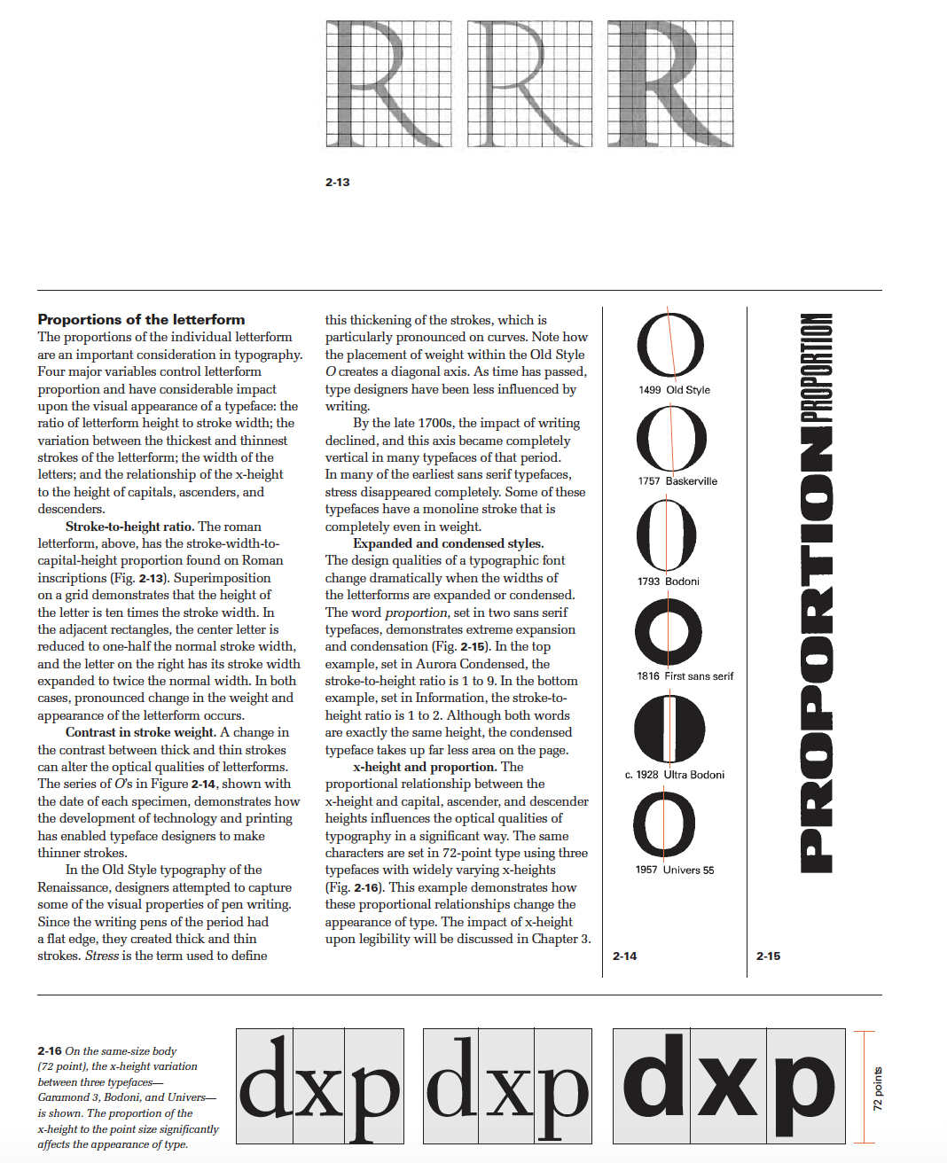
Fig5.1a.01_"typographic design" book by Rob Carter
1. The Evolution of Typography
2. The Anatomy of Typography
3. Legibility
4. The Typographic Grid
5. Syntax and Communication
6. The Typographic Message
7. The Evolution of Typographic Technology
8. Typography on Screen
9. Typography in Time and Motion
This book’s sixth edition reflects a view of typography that transcends specific technologies or media. A knowledge of typographic fundamentals is key to communicating in all environments—static, dynamic, or kinetic—and the first few chapters address the basics of form, syntax, how type communicates, and its potential for expression. Current typographic design practice can be better understood if one understands the evolution of earlier typesetting processes, and Chapter7 provides that background for new designers, many who will work primarily in digital environments.














Comments
Post a Comment